.avif)




Why web design has become strategic for accounting firms
The accounting profession is going through an unprecedented digital transformation. In 2026, having a website is no longer enough: it has to embody your expertise, reassure your prospects and set you apart from your competitors. The visitors who arrive on your site look for signals of competence before they even read your services.
The design trends of 2026 are not simple aesthetic effects. They answer precise goals: catching attention in under 3 seconds, making complex services easier to understand, and turning visitors into clients. For a chartered accountant, the stake is twofold: demonstrating your technical command while humanising a discipline seen as austere.
This article sets out the 10 major design trends of 2026 specifically adapted to accounting firms. Each trend comes with concrete examples and practical applications for your website.
1. Data-centric design: when the figures become your visual signature
Putting data at the heart of the visual identity
Data-centric design turns data into central graphic elements of your site. Figures, dashboards, performance indicators and statistics are no longer relegated to secondary pages: they become the immediate visual proof of your expertise.
That approach answers a fundamental expectation of your prospects: the search for tangible proof of competence. When an SME director visits a chartered accountant's site, they want to know whether you genuinely master the issues of their sector. Showing concrete data from the home page onwards creates that trust instantly.
Concrete applications for your firm
Picture a home page showing, in real time or as animated widgets:
- 342 companies supported with a counter that scrolls
- 98% client satisfaction rate shown as a circular progress bar
- 15 years of average experience across the team with an interactive timeline
- 2.3M€ of tax savings generated for your clients in 2025
Those elements can take the form of interactive cards that animate on hover, revealing extra detail. Hovering over "342 companies supported", for instance, could show a tooltip specifying "of which 87% small businesses and 13% self-employed professionals".
Examples of technical implementation
For the services page, create an interactive dashboard showing:
- The average number of tax returns handled per month
- The average time taken to process a file
- The compliance rate with legal obligations
- The number of tax audits supported with no reassessment
For the sector expertise page, show:
- A comparative chart of average margins by sector
- Key performance indicators by client type
- A map of France showing your coverage with the number of clients per region
The advantage of data-centric design for a chartered accountant is threefold: it demonstrates your expertise through proof, it reassures through transparency, and it sets you radically apart from traditional accounting sites that are still very text-heavy.
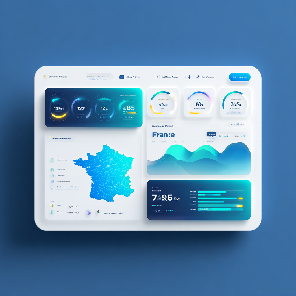
2. Controlled asymmetry: breaking the codes without losing professionalism
Why abandon the rigid traditional grids
Chartered accountants' websites long adopted ultra-symmetrical, rigid layouts, meant to embody the seriousness of the profession. That era is over. In 2026, controlled asymmetry lets you create dynamic visual compositions that catch attention while keeping a clear structure.
Asymmetry does not mean chaos. It is about creating varied visual rhythms: a wider text zone here, an offset image there, a service block that spills slightly out of its grid. That approach naturally guides the visitor's eye towards the important elements.
Putting it into practice on your strategic pages
An asymmetrical home page: instead of a classic centred banner, create a composition where your main title occupies the left two thirds of the screen, while an image or an illustration of your team advising a client occupies the right third with a slight spill downwards. That visual break creates interest immediately.
An offset services section: organise your offers (accounting, tax advice, payroll) in cards of different sizes. The card for the flagship service ("support for small and mid-sized companies", for instance) will be 1.5 times wider than the others, set slightly back. The complementary services arrange themselves around it in smaller formats, creating a clear visual hierarchy.
Client testimonials in organic composition: rather than three testimonials aligned side by side, set them out staggered with varying heights. The first testimonial starts top left, the second begins 30% lower on the right, the third picks up at mid-height on the left. That dynamic arrangement encourages a full read.
The golden rules of professional asymmetry
For an asymmetrical layout to stay professional and suited to an accounting firm, respect these principles:
Keep an invisible alignment: even if the elements look offset, they have to align on an underlying grid. All your text blocks start on multiples of 20 pixels, for instance.
Limit the angles of offset: use clean horizontal or vertical offsets rather than excessive diagonals. A block offset 40 pixels to the right stays readable; a 15-degree tilt quickly becomes unreadable.
Keep zones to breathe: asymmetry must not create excessive density. Keep generous white space between your offset elements.
Test readability on mobile: an asymmetry that works on desktop has to reorganise intelligently on mobile. Plan for your offsets to soften or disappear on a small screen.
That trend radically transforms an accounting firm's brand image: you move from a traditional, rigid image to a modern, accessible perception, without sacrificing your professional credibility.
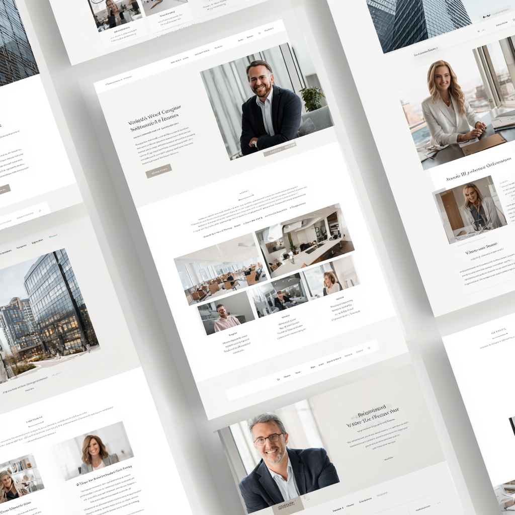
3. Modular design systems: coherence in service of efficiency
What a modular design system is
A modular design system is a library of coherent, reusable visual components: buttons, service cards, contact forms, icons, pricing blocks, client testimonials. Every element is designed once with precise rules (colours, typefaces, spacing, animations), then reused across the whole site.
For an accounting firm, that approach has decisive advantages. Visual safety: every new piece of content added automatically respects your brand identity. Maintenance efficiency: a change to one module ripples instantly through every instance of it. An optimised user experience: your visitors quickly develop navigation reflexes.
The essential components for a chartered accountant's site
The "service card" module: create a standardised component for presenting each of your services. Standard structure:
- A custom icon at the top (30x30px, primary colour)
- The service title (H3, 24px, bold)
- A short description (3 lines at most, 16px)
- A list of 3 or 4 key benefits (custom bullets)
- An action button ("find out more" or "request a quote")
That module keeps the same structure whether you are presenting "bookkeeping", "tax returns" or "payroll management". Only the content changes.
The "key figure" module: a component for your data-centric statistics:
- The main number (large typography, 48px, accent colour)
- An explanatory label (secondary text, 14px)
- An animation on scroll (a counter running from 0 to the final figure)
- An optional contextual icon
The "client testimonial" module: a unified format for showcasing your feedback:
- The client quote (italic text, typographic quotation marks)
- A photograph of the director or the company logo (a circle, 60px across)
- The client's name, role and company
- A rating or satisfaction indicator (stars or a score)
- An optional link to the full case study
The "frequent question" module: an interactive accordion for your FAQ:
- The question permanently visible (clickable)
- The answer that unfolds on click with a fluid animation
- A plus or minus icon that switches with the state
- The option of keeping several questions open at once
Operational advantages for your firm
Imagine you want to add a new "tax audit assistance" service to your site. With a modular system:
Without a modular system: you have to create a new page, think about its layout, choose the colours, define the spacing, create the buttons, check the coherence with the rest of the site. Estimated time: 3 to 4 hours.
With a modular system: you duplicate the existing "service page" module and replace the text content and the icon. The design, the spacing, the animations and the buttons are already defined. Estimated time: 30 minutes.
That efficiency translates into substantial savings in development and maintenance, while guaranteeing a homogeneous user experience that reinforces your professional brand image.
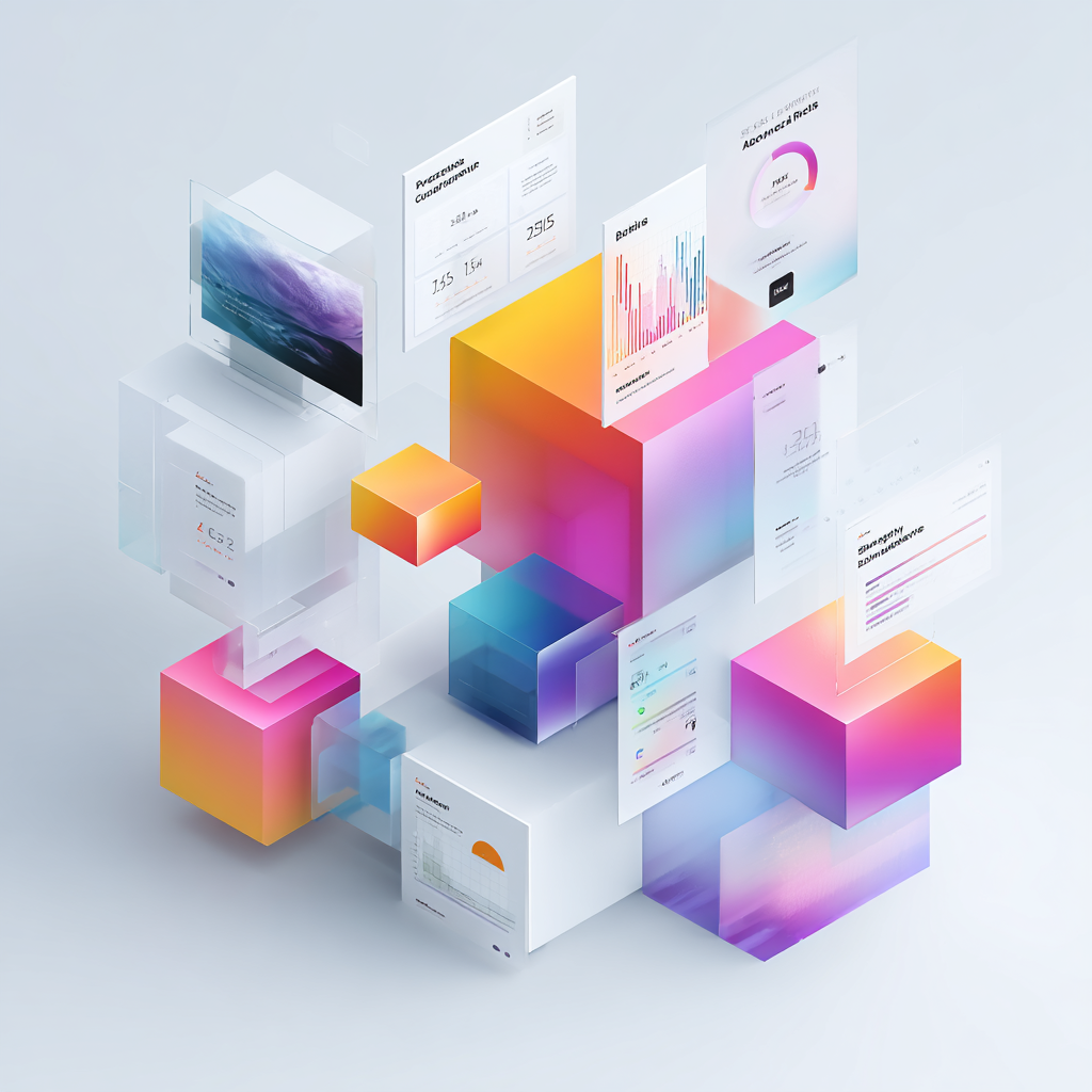
4. Interactive storytelling: telling your expertise as the page scrolls
Turning your site into a narrative journey
Interactive storytelling means building your site as a story that unfolds progressively while the user scrolls down the page. Rather than static sections stacked on top of one another, every scroll reveals a new stage of the story, creating a fluid, engaging journey.
For a chartered accountant, that approach lets you guide the prospect methodically: from becoming aware of their needs to understanding your expertise, through to the decision to contact you. It works particularly well for complex services that need explanation and reassurance.
A concrete example: the client journey timeline
Create a "how we work together" section as a vertical timeline animated on scroll. Every stage reveals itself progressively:
Stage 1 - first contact (appears at 20% of the scroll):
- Animation: a phone or an email icon enters the screen from the left
- Text: "you contact us for a first 20-minute phone conversation, with no commitment"
- Visual element: a photograph of a colleague on the phone, smiling
Stage 2 - free diagnosis (appears at 40% of the scroll):
- Animation: a document unfolds with checklist elements
- Text: "we analyse your current accounting and tax situation free of charge"
- Visual element: an anonymised screenshot of a typical diagnosis
Stage 3 - a personalised proposal (appears at 60% of the scroll):
- Animation: a chart or table builds progressively
- Text: "we present our costed recommendation and our implementation schedule"
- Visual element: a preview of a commercial proposal
Stage 4 - starting the engagement (appears at 80% of the scroll):
- Animation: gears start turning
- Text: "we take on your accounting within 48 hours with a structured onboarding"
- Visual element: an illustrated start-up schedule
Stage 5 - regular follow-up (appears at 100% of the scroll):
- Animation: a dashboard with indicators updating
- Text: "you get access to your client space and receive your monthly dashboards"
- Visual element: the client space interface
Applications for your specific service pages
The "company formation" page: create a storytelling that accompanies the founder:
- Section 1: "your idea" (scroll 0-20%) - an animation of a light bulb switching on
- Section 2: "choosing the legal form" (scroll 20-40%) - an animated comparison of the company structures
- Section 3: "business plan" (scroll 40-60%) - financial charts building up
- Section 4: "administrative formalities" (scroll 60-80%) - a checklist ticking itself off progressively
- Section 5: "launch" (scroll 80-100%) - fireworks or a celebration animation
The "restaurant sector expertise" page: tell the annual cycle of the business:
- January to March: preparing the accounts and the tax returns (a calendar animation)
- April to June: tax planning and advice (an animation of the savings made)
- July to August: managing the high season (a cash flow animation)
- September to December: preparing the next year (a projection animation)
Technical aspects of the implementation
Those scroll animations generally use light JavaScript libraries such as GSAP's ScrollTrigger or Webflow's native solutions. What matters is respecting certain principles:
Fluidity: the animations have to be linearly tied to the scroll, with no jerks. When the user scrolls 10%, the animation progresses 10%.
Performance: limit yourself to 5 to 7 animated sections per page at most to avoid slowdowns, notably on mobile.
Accessibility: always offer a "reduce animations" option for users sensitive to movement, and make sure the content stays readable without JavaScript.
That narrative approach turns a visit to your site into a memorable experience that sets you apart instantly from competing accounting firms with static, impersonal sites.
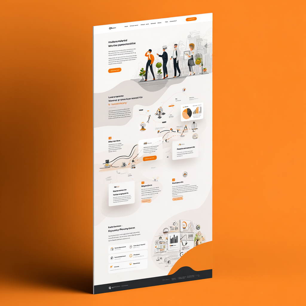
5. Micro sound design: subtle audio feedback to reinforce the experience
The emergence of discreet sound design
Micro sound design introduces very subtle audio feedback during interactions on your site: a light click on hovering a button, a validation sound when a form is sent, discreet audio feedback when the page changes. Those sounds, generally under 0.3 seconds, enrich the experience without ever being intrusive.
For an accounting firm, that trend may look surprising. Yet it answers an important psychological point: reinforcing the perception of quality and modernity while guiding the user through their actions. It is the digital equivalent of the reassuring feel of a quality pen's click or the soft closing of a premium car door.
When and how to bring micro-sounds in
Form validation: when a prospect submits the contact request form, a short, positive sound (a clear ascending note of 0.2 seconds) confirms the action has registered. That immediate feedback reduces the anxiety of not knowing whether it sent.
A concrete example: on your "request a quote" form, after clicking "send":
- A validation sound (an ascending note)
- A visual confirmation message appearing at the same time
- The button changes state with a synchronised animation
Navigation between sections: on clicking the main menu elements, a discreet micro-sound (a muffled "tap") reinforces the sense that the site is responsive. The user understands instantly that their action registered, even if the page takes 0.5 seconds to load.
Interactions with the calculators: if you offer a tax savings simulator or a payroll cost calculator, every figure entered can carry a discreet keyboard sound. The final calculation can trigger a more assertive validation sound.
Triggering the animations: when a data-centric statistic animates on scroll (the counter running from 0 to 342 clients), a very muted mechanical counter sound can accompany the animation. That creates a multi-sensory coherence.
The imperative rules for a successful implementation
Extremely low volume: the micro-sounds have to be barely audible, between 10% and 20% of maximum system volume. They should be perceptible but never dominant.
Easy to switch off: systematically offer a sound icon in the header with two states (sound on and off). Respect the user's choice and save that preference in a cookie.
Respect for system preferences: the code has to detect whether the user has switched on "reduce motion" in their operating system settings and automatically disable every sound.
Optimised loading: use ultra-compressed audio files (WebM or OGG format) under 10 KB each. Favour lazy loading so the sounds only load if the user interacts with the elements concerned.
Sound coherence: create a small sound palette (3 to 5 sounds at most) that hangs together. For instance:
- Sound 1: a light interaction (hovering a button)
- Sound 2: positive validation (a form sent)
- Sound 3: a change of section
- Sound 4: an error or an impossible action (very rare)
Adapting it to the professional accounting context
For a chartered accountant, micro sound design has to stay extremely subtle and optional. The aim is not to create a playful experience, but to discreetly reinforce the sense of quality and modernity.
The best candidates for audio feedback are:
- The interactive tools (simulators, calculators)
- The strategic contact forms
- The main navigation elements
- The important data-centric animations
To be avoided absolutely:
- Sounds on page load (intrusive)
- Sounds on every link hover (saturating)
- Loud or melodic sounds (unsuited to a professional context)
- Automatic sounds with no way to switch them off (disrespectful)
Implemented intelligently, micro sound design can raise form completion rates by 15 to 20%according to some user experience studies, thanks to the immediate reassurance it gives.

6. "Grade-school" palettes: educational simplicity in service of clarity
Understanding grade-school colours
"Grade-school" palettes draw on the visual codes used in teaching and education: clear, readable, reassuring primary and secondary colours. They are characterised by calming blues, validation greens, attention oranges (not aggressive ones), and complementary palettes that are simple to decode.
That trend answers a central problem for chartered accountants: making complex subjects visually accessible. Accounting, tax and employment law are intimidating fields for plenty of directors. A simple, educational colour palette helps take the mystique out of those subjects.
Examples of palettes suited to accounting firms
The "modern trust" palette :
- Main blue:
#2B5EAA(a reassuring institutional blue, but less sombre than traditional navy) - Validation green:
#4CAF50(a positive green for successes and savings made) - Accent orange:
#FF9F43(a soft orange for the calls to action, not aggressive) - Neutral grey:
#F5F7FA(light backgrounds) - Main text:
#2D3748(a very dark grey, less brutal than pure black)
Concrete application: use the main blue for your header and footer, the green to highlight the figures for savings or client satisfaction, the orange for your main action buttons ("book a meeting"), and the greys to structure your content.
The "educational clarity" palette :
- Light blue:
#5DA5DA(a sunny sky blue) - Soft yellow:
#FAD648(a schoolroom yellow, not fluorescent) - Pale pink:
#F49AC2(a tender pink for certain illustrations) - Mint green:
#98D8C8(a refreshing green) - Slate grey:
#6C7A89(a readable text grey)
That palette works particularly well for firms that want to project an accessible, modern image, notably those targeting young entrepreneurs or small businesses.
Practical application on your site
A colour code by kind of service: give a grade-school colour to each family of services:
- Everyday accounting: blue
- Tax and planning: green
- Employment and payroll: orange
- Strategic advice: soft purple
- Company formation: yellow
When a visitor moves around your site, they identify the theme immediately through the colour code. Every page tied to tax, for instance, uses green accents in its titles, its icons and its buttons.
Visualising data with clarity: use your grade-school palette for your charts and tables:
- Revenue development chart: a light blue line
- Tax savings chart: a green area
- Cash flow alert chart: an orange area (not an aggressive red)
- Optimistic projections: green, cautious projections: yellow
Educational visual hierarchy: in your complex explanatory content ("how to improve your corporation tax position", for instance), use coloured boxes:
- A blue box: a definition or a regulatory reminder
- A green box: a useful point or a tip
- An orange box: a point of attention or a deadline
- A yellow box: a worked example or a case study
The psychological and business advantages
Reduced anxiety: grade-school colours create a visually less intimidating environment. A director who does not master the accounting side feels less judged, better supported.
Better recall: simple colour codes make navigation and memory easier. After a first visit, the prospect remembers that "the green page was about tax" and goes straight back to it.
Strong differentiation: while most chartered accountants' sites still use very sombre palettes (navy plus grey plus white), adopting a grade-school palette immediately positions you as modern, accessible and good at explaining.
Coherence with an advisory approach: if your position stresses support and explanation (and not only technical execution), your visual palette has to reflect it. Educational colours embody that promise visually.

7. Organic anti-grid layouts: leaving the frame without losing the structure
Going beyond the rigid traditional grids
Anti-grid or organic layouts push the concept of asymmetry further by creating visual compositions that interlace naturally, like elements partly overlapping, images spilling out of their container, or text zones following soft curves rather than strict rectangles.
For a chartered accountant, that approach can look risky: will it not harm professional credibility? In reality, well executed, it produces the opposite effect: it positions you as a modern firm that masters the contemporary codes while staying deeply competent on substance.
Concrete examples of application
A header with a spilling image: rather than a classic rectangular banner, create a header where:
- Your title and your strapline occupy the left half on a flat background (the primary colour)
- A photograph of your team or your office spills slightly over the text area with an organic mask (a soft curve, no square corners)
- The main action button sits in light overlap between the two zones
The visual result: immediate dynamism while keeping the message completely readable.
A team section with overlap: instead of photographs aligned in a grid, create a composition where:
- The first partner's photograph is slightly larger and set in the foreground
- The other colleagues' photographs partly overlap (20% coverage)
- The names and roles sit on labels that spill slightly out of the photographs
- A subtle depth effect (a soft drop shadow) reinforces the sense of layers
Content blocks with organic shapes: on your service pages, use containers with soft shapes:
- Instead of rectangles with square corners, adopt substantial border radii (30-50px)
- Create asymmetrical shapes using custom SVG curves
- Let certain elements (icons, illustrations) spill slightly out of their container
Technical implementation without sacrificing the experience
The principle of the invisible container: even if the elements look organic and free visually, they stay inside an invisible grid that guarantees:
- Correct alignment of the text zones (readability)
- Predictable responsive behaviour (mobile adaptation)
- Coherent spacing (room to breathe)
Using CSS clip-path : to create organic shapes without heavy images:
Service section: a clip-path polygon with soft curves
Team images: a circle or ellipse clip-path
Quote blocks: a clip-path with a custom asymmetrical shape
Handling responsive: plan for the organic layouts to simplify on mobile:
- The overlaps become classic vertical stacks
- The spills reduce or disappear
- The organic shapes keep their rounded corners but return to a more conventional structure
The strategic zones for the organic approach
To favour :
- The home page (the hero and firm presentation sections)
- The about and team page (humanisation)
- The client testimonial pages (warmth)
- Specific landing pages (differentiation)
To avoid :
- Long technical content pages (tax, employment)
- Complex forms (clarity comes first)
- Data tables (a rigid structure is needed)
- Legal pages (seriousness is expected)
The anti-grid approach works particularly well alongside a modular design system: you keep the coherence and the efficiency of the modules, but you lay them out organically and surprisingly rather than in predictable grids.

8. Textured depth effects: depth and atmospheric gradients
Creating relief without tipping into excess
Textured depth effects and atmospheric gradients mean adding subtle visual dimension to your site: soft drop shadows, light multi-colour gradients, transparency effects, discreet background textures. The aim is to create a sense of relief and quality without falling into the visual excesses of glassmorphism or neomorphism.
For a chartered accountant, those effects serve a precise purpose: visually distinguishing the important areas (calls to action, key sections) while keeping a professional, contemporary aesthetic.
Concrete applications of shadow and depth
Service cards with progressive shadows: your service presentation modules can use a subtle drop shadow that intensifies on hover:
- Initial state:
box-shadow: 0 2px 8px rgba(0,0,0,0.08) - Hover state:
box-shadow: 0 8px 24px rgba(0,0,0,0.15) - A fluid transition:
transition: box-shadow 0.3s ease
That micro-interaction animation visually says the element is interactive and invites the click.
Action buttons with depth: your main calls to action ("book a meeting", "request a quote") gain impact with:
- A subtle gradient in the button's colour (two close shades of your primary colour)
- A drop shadow suggesting the button is slightly raised
- On click, an animation that "presses" the button in (a reduced shadow, a slight vertical offset)
Sections with atmospheric backgrounds: create distinctive sections with soft atmospheric gradients:
- The testimonials section: a very light blue to white gradient (
#F0F7FF→#FFFFFF) - The final call-to-action section: a gradient from your primary colour at 20% opacity towards transparent
- The key figures section: a radial gradient running from the centre to the edges
Subtle textures to enrich without overloading
A light noise texture: apply a very subtle noise texture (3 to 5% opacity) over your flat colour backgrounds. That texture, imperceptible from a distance, creates a visual richness on reading that avoids the too-perfect "digital flat" look.
A discreet dot grid: for your data-centric or technical sections, add a grid of small dots in the background (10% opacity) evoking spreadsheets or technical charts. That subliminal visual reference reinforces your position as an expert in figures.
Organic mesh gradients: mesh gradients (complex gradients where several colours blend organically) create sophisticated backgrounds:
- Use 3 or 4 colours from your grade-school palette
- Very reduced opacity (15 to 25%)
- Applied as the background of the hero or footer sections
The rules of professional dosage
Hierarchical coherence: every element at the same hierarchical level has to carry the same shadow intensity. For instance:
- All your service blocks have the same base shadow
- All your primary buttons have the same depth
- All your testimonial cards share the same treatment
Limiting the number of effects: never stack more than 2 depth effects at once on the same element. A button can have a shadow plus a gradient, but not a shadow plus a gradient plus a texture plus a glowing border.
Adapting to dark themes: if you offer a dark mode (a strong user experience trend in 2026), invert the logic of the shadows:
- The shadows become soft light glows
- The gradients darken rather than lighten
- The textures stay subtle but in negative
Performance and accessibility: the depth effects have to:
- Use optimised CSS properties (transform, opacity) rather than heavy images
- Switch themselves off automatically if the user has enabled "reduce motion"
- Keep sufficient contrast (a 4.5:1 ratio minimum) between text and background even with gradients
Those textured depth effects let you create a visually rich, premium site without the graphic excess that would harm a chartered accountant's professional credibility. It is the perfect balance between aesthetic modernity and professional seriousness.

9. Organic and hand-drawn illustration: humanising accounting expertise
Why favour custom illustration
Organic, hand-made illustrations (or ones that give that impression) are progressively replacing generic visuals bought from stock libraries. Those custom illustrations can take several forms: simple line drawings, stylised characters, hand-made explanatory diagrams, unique icons, infographics in an illustrated style.
For an accounting firm, the stake is major: humanising a discipline seen as cold and technical. A hand-drawn illustration explaining the accounting cycle will be infinitely more engaging than a generic corporate diagram. It says that behind the figures are humans who take care to understand and to explain.
The kinds of illustration suited to the accounting sector
Process illustrations: create custom visual diagrams to explain your processes:
- The journey of a supplier invoice through your system
- The stages of closing a financial year
- The annual tax calendar
- The onboarding process for a new client
Recommended style: a simple line (2 to 3px), the colours of your grade-school palette, minimalist stylised characters (improved stick figures), organic arrows and connectors (not strict straight lines).
Custom professional icons: instead of using standard icon sets (Font Awesome, Material Icons), create or commission your own:
- A stylised calculator for "accounting"
- Scales with coins for "tax"
- Characters in conversation for "advice"
- A document with a stamp for "legal"
- A rising chart for "management reporting"
Those custom icons, used systematically across your site, become strong identity elements your clients associate with your firm.
Characters representing your audience: illustrate your target personas with drawn characters:
- The restaurateur with their chef's hat (if you have restaurant expertise)
- The self-employed doctor (medical profession expertise)
- The young entrepreneur with their laptop (company formation expertise)
- The director of an industrial SME (industry expertise)
Those characters create immediate identification: your prospects recognise themselves visually in the illustrations.
Illustrated educational infographics: turn your technical content into hand-made infographics:
- "The 5 accounting mistakes founders make" with gently humorous illustrations
- "How to reduce your corporation tax: 4 levers" with an illustrated diagram
- "Timeline: preparing for your tax audit" with a drawn chronology
The balance between professionalism and accessibility
Stylistic dosage: your illustrations have to stay professional. Favour:
- Clean, confident lines (no rough sketching)
- Coherent, harmonious proportions
- Controlled colours (your palette, no anarchic rainbow)
- A constant style (the same level of detail, the same line weight)
The priority zones for application :
- The home page (the "our approach" explanatory section)
- The service pages (illustrating the client benefit)
- The team page (illustrated portraits alongside the photographs)
- Educational blog articles (explanatory diagrams)
- Downloadable guides (the cover and the internal illustrations)
The zones to treat conventionally :
- Forms (clarity comes first)
- Data tables (readability)
- Official documents (seriousness is expected)
- Legal pages (restraint)
Practical implementation
Option 1 - working with an illustrator: invest in building a library of custom illustrations (budget: 1,500 to 3,000 € for 20 to 30 professional illustrations). Those illustrations become reusable brand assets.
Option 2 - assisted creation tools: use platforms such as:
- Humaaans (modular customisable characters)
- Blush (illustrations customisable by style)
- Undraw (open source illustrations customisable by colour)
Personalise them with your colour palette to create a unique visual coherence.
Option 3 - a mix of photographs and illustration: overlay illustrated elements on your professional photographs:
- A photograph of your office with drawn graphic elements overlaid (arrows, speech bubbles, annotations)
- A photograph of your team with floating illustrated icons showing the areas of expertise
- Illustrated diagrams built into screenshots of your tools
That hybrid approach keeps the seriousness of the photograph while bringing the educational touch of illustration.
Organic illustration turns your site from a purely informational tool into an engaging educational medium that makes understanding easier, reduces prospects' anxiety, and builds a memorable visual identity.

10. Performance-first and content-centric design: technique in service of search
Understanding the performance-first approach
Performance-first design puts speed and technical efficiency at the heart of every design decision. It is no longer a matter of creating a sophisticated design first then trying to optimise it, but of designing from the outset under strict performance constraints: loading time under 2 seconds, optimised images, light code, an SEO-friendly technical architecture.
For a chartered accountant, that approach is decisive because it directly affects your visibility on Google and your conversion rate. A site that loads in 1.5 seconds converts 2 to 3 times better than one taking 5 seconds. A technically well-structured site ranks better on "chartered accountant [your city]" than a competitor with a flashy but slow design.
The essential technical optimisations
Next-generation images: convert every image to WebP or AVIF:
- A 30 to 50% reduction in weight against JPEG with no visible loss of quality
- Progressive loading (appearing blurred then sharp)
- Systematic lazy loading (images loaded only when they enter the viewport)
A concrete example: an 800 KB team photograph in JPEG becomes 250 KB in WebP with intelligent compression.
A semantic content hierarchy: structure your pages with a strict HTML architecture:
- One H1 per page (the main title, carrying the main keyword)
- H2 for the main sections (sub-keywords or variants)
- H3 for the sub-sections
- Text enriched with strong and em tags used intelligently
- Bulleted and numbered lists for enumerations
That structure lets Google understand the hierarchy of information instantly and identify your areas of expertise.
Internal link architecture: build intelligent linking between your pages:
- From "accounting for small and mid-sized companies", link to "tax returns" and "payroll management"
- From "company formation", link to "business plan" and "choosing the legal form"
- From every blog article, link to 2 or 3 relevant service pages
The aim: letting Google crawl your whole site efficiently and distribute the authority towards your strategic pages.
Schema.org and structured data: implement the structured data tags to improve your visibility:
- LocalBusiness for your firm (address, telephone, opening hours)
- ProfessionalService for your services
- FAQPage for your frequently asked question pages
- Review for your client testimonials
- Person for your partners' profiles
Those data let Google show rich snippets that significantly raise your click-through rate in the search results.
Content-centric: putting the content at the centre
A visual hierarchy guided by the information: your design choices have to serve the content, not the other way round:
- The titles are immediately visible and readable (a sufficient size, strong contrast)
- The paragraphs are airy (a line height of 1.6 to 1.8)
- The main content zones occupy 60 to 70% of the screen width (no columns that are too narrow)
- The calls to action are placed after valuable content, not before
A structured SEO content strategy: every page has to answer a precise search intent:
- The "chartered accountant Toulouse" page → local transactional intent
- The "how to choose your chartered accountant" article → informational intent
- The "accounting fees" page → commercial intent
- The "starting your business: the complete guide" → informational intent plus a lead magnet
Every kind of content has its optimal structure:
- Service pages: 800 to 1,200 words, 4 to 6 H2s, 1 or 2 tables, a built-in FAQ
- Blog articles: 1,500 to 2,500 words, 6 to 10 H2s, concrete examples, infographics
- Local pages: 600 to 800 words, precise geographic information, an interactive map
Improving readability: apply the principles of web readability:
- A modern sans-serif typeface (Inter, Open Sans, Lato) at 16 to 18px minimum
- A line length between 50 and 75 characters (neither too short nor too long)
- A minimum text to background contrast of 4.5:1 (WCAG AA)
- Spacing between paragraphs equivalent to 1.5 times the line height
Measuring and improving continuously
Core Web Vitals: watch Google's 3 essential metrics:
- LCP (Largest Contentful Paint): under 2.5 seconds
- FID (First Input Delay): under 100 milliseconds
- CLS (Cumulative Layout Shift): under 0.1
Use Google PageSpeed Insights to identify the priority improvements.
Bounce rate by page: analyse in Google Analytics which pages have a high bounce rate (>60%):
- If it is a service page: a content or value proposition problem
- If it is an article: a relevance or structure problem
- If it is the home page: a problem with the clarity of the message
Time spent on the key pages: measure whether your visitors genuinely read your content:
- An average over 2 minutes on a blog article means engaging content
- An average under 30 seconds on a service page means content to rework
The performance-first and content-centric approach guarantees that your investment in design translates directly into business results: qualified traffic, engaged prospects, and clients converted.
How to combine these trends for your accounting firm
Building your own strategic mix
The 10 trends set out here should not all be applied at once. The aim is to select 4 to 6 trends that match your position and combine them harmoniously.
For a traditional firm looking to modernise :
- Performance-first (essential)
- A modular design system (efficiency)
- Discreet data-centric design (credibility)
- A grade-school palette (accessibility)
For a firm focused on young entrepreneurs and startups :
- Interactive storytelling (engagement)
- Organic illustration (closeness)
- Controlled asymmetry (differentiation)
- Micro sound design (innovation)
For a premium firm with deep expertise :
- Data-centric design (proof of performance)
- Depth effects (visual quality)
- Anti-grid layouts (singularity)
- Performance-first (technical excellence)
Prioritising and rolling out progressively
Phase 1 - foundations (months 1-2) :
- A modular design system
- Performance-first
- A grade-school palette
Phase 2 - differentiation (months 3-4) :
- Data-centric design
- Asymmetry or anti-grid layouts
- Organic illustration
Phase 3 - refinement (months 5-6) :
- Interactive storytelling
- Depth effects
- Micro sound design (optional)
That progressive approach lets you measure the impact of every improvement and adjust your strategy according to the results obtained (traffic, engagement, conversions).
Conclusion: your site as a tool of strategic differentiation
In 2026, a chartered accountant's website is no longer a simple information medium. It is your first salesperson, your tool for demonstrating expertise, and your main lever of differentiation in the face of sharper competition.
The 10 design trends set out here share a common goal: transforming how your firm is perceived by combining professional credibility with modern accessibility. They let you answer your prospects' contradictory expectations: unquestionable technical expertise AND reassuring human support.
Investing in web design aligned on these trends is measured in concrete return:
- More organic traffic thanks to performance-first
- A better conversion rate thanks to storytelling and visual clarity
- A lower client acquisition cost thanks to reinforced credibility
- Better client retention thanks to a premium user experience
The moment to act is now. Your prospects are already comparing your site with your competitors'. Every day without improvement is a business opportunity lost. Start with an audit of your current site, identify the 3 or 4 trends most relevant to your position, and plan their progressive roll-out.
Your accounting expertise deserves a digital setting worthy of it. These 10 design trends of 2026 are the keys to getting there.
.jpg)

.webp)