.avif)




In a sector where trust is the pillar of every client relationship, your website is not only a digital shop window: it is the first adviser your prospects meet. In 2026, the wealth management advisers who stand out are the ones who have understood that their website's design has to translate visually the values of seriousness, transparency and expertise they embody day to day.
This year's design trends mark an important turn: no more cold, austere institutional sites that look like online banks. In their place, interfaces that combine professionalism with human warmth, where financial complexity becomes accessible through a design built to reassure and to guide.
Whether you are launching as an independent adviser, modernising your family firm's site or simply looking to improve your online conversion, these 10 design trends give you the keys to a website that inspires trust in the first seconds.
1. Design built on confidentiality and data transparency
Why confidentiality is becoming a major design argument
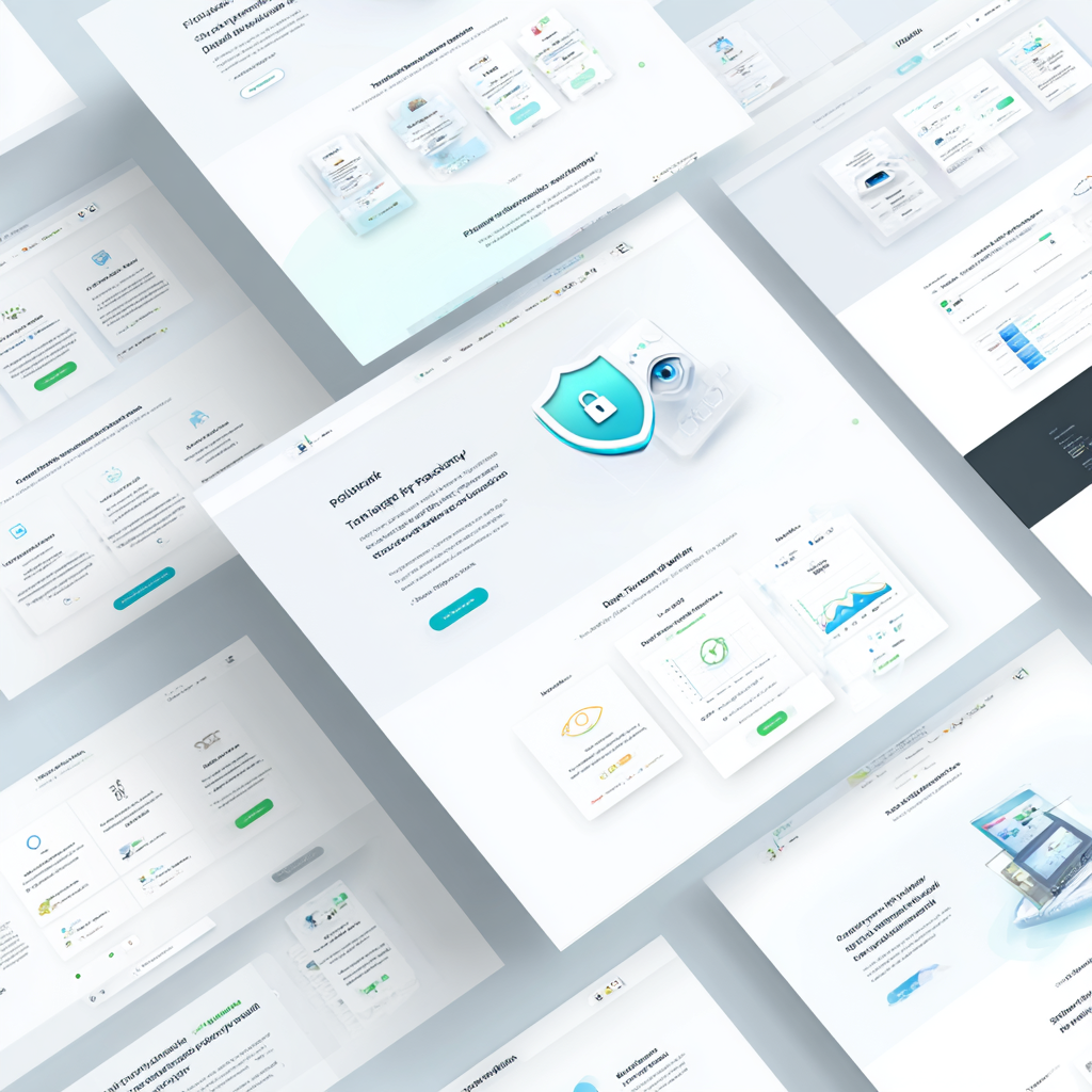
In 2026, showing your privacy policy in small grey type in the footer is no longer enough. Your potential clients entrust you with their wealth, their life plans and their most sensitive financial data. Transparency about how data is used has to be visible, understandable and reassuring from the home page onwards.
That trend turns a technical aspect into a genuine marketing asset: concretely showing how you protect your clients' information becomes a design element in its own right.
How to build data transparency into your design
Create a dedicated block on your home page explaining your confidentiality commitment in simple terms. Rather than indigestible legal text, choose a visual presentation with clear icons: a padlock for security, a shield for GDPR protection, a crossed-out eye for the absence of data resale.
Interactive tables are a major innovation in this field. One Paris wealth management firm, for instance, built a clickable diagram showing the journey of every piece of data: from filling in the contact form to its use in personalising the wealth review. Every step is shown with calming colour codes and accessible explanations.
The consent settings should no longer be hidden in submenus. Build them straight into your interface with visual toggles, intuitive sliders and contextual explanations that appear on hover. A client has to be able to understand in 10 seconds what they are accepting and why.
The measurable impact on conversion
The firms that have adopted this approach see an average rise of 34% in the completion rate of contact forms. Why? Because transparency shown from the start lifts the psychological brakes. Your prospects no longer hesitate at the moment of entering their estimated wealth or their investment plans.
2. Reassuring geometric simplicity

The art of organising financial complexity
Wealth concepts are naturally complex: splitting ownership, multi-fund life assurance, wealth tax planning. Your design has to turn that complexity into visual clarity. Geometric simplicity is not extreme minimalism, it is intelligent structuring that guides the eye and makes understanding easier.
Geometry brings a reassuring frame in a sector where the sums at stake can be dizzying. Clean, organised shapes translate your professional rigour visually.
Structuring your services concretely
Organise your services into distinct square or circular sections on your home page. For instance, four squares of equal size for your four pillars: wealth review, tax strategy, investments, transfer of wealth. Each square carries a simple geometric icon, a short title and one line of hook.
For the client journey, create a linear diagram with geometric steps. Picture five circles joined by lines, representing your process: first contact → analysis of the situation → personalised recommendations → implementation → annual review. Each circle lights up or changes colour on hover, with explanatory text appearing.
Comparison tables benefit particularly from this approach. Instead of a spreadsheet copied and pasted, present your different investment solutions in aligned rectangles with heights proportional to average returns, standardised risk icons and coherent colour codes.
Visual hierarchy through geometry
Use the size of the geometric shapes to signal importance. Your flagship service, the complete wealth review, can occupy a wider central hexagon, surrounded by smaller pentagons for the complementary services. That immediate visual hierarchy saves the visitor from having to read every line of text to understand your main offer.
3. Grainy textures and tactile elements
Humanising the digital wealth experience
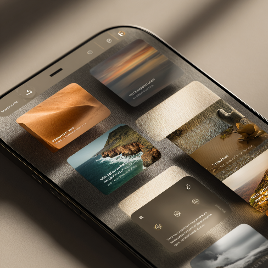
The financial sector suffers from a cold, impersonal, almost robotic image. In 2026, the wealth management advisers who succeed online are the ones who bring warmth and touch back into their interfaces. Grainy textures create a sense of materiality that traditional financial sites sorely lack.
That trend answers a deep psychological need: when a client entrusts you with family wealth built over three generations, they need to feel they are dealing with a human, not an algorithm.
Applying textures concretely
Build a subtle paper or linen background behind your main content sections. It is not a visible, garish grain, but a discreet texture that reveals itself as you scroll. The area holding your client testimonials, for instance, can have a background recalling laid paper, unconsciously evoking official documents and reliability.
The action buttons deserve particular attention. Instead of a flat colour, add a light grain that gives the impression of a physical button you could press. When the cursor hovers over it, a subtle animation can heighten the tactile effect, as if the button were lifting slightly.
For the service cards, use soft multi-layer shadow effects that create real depth. A card presenting your wealth transfer advisory service should not float flat on the page, but seem laid down with relief, like a professional brochure you could almost touch.
Textured zones of trust
The critical sections where you ask for sensitive information benefit particularly from this approach. The wealth review request form can sit on a textured background recalling high-quality paper, with input fields that look engraved. That texture reassures unconsciously: you do not entrust your wealth on an ordinary form, but on a medium that has weight.
4. A natural, earthy colour palette
The psychology of colour in wealth management
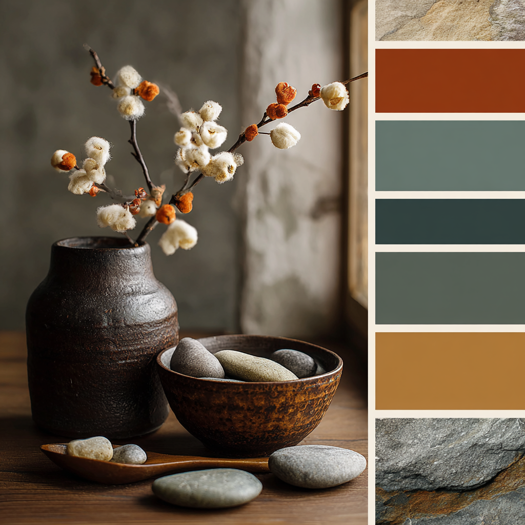
Colours are never neutral, still less in a sector where you manage the financial future of whole families. In 2026, natural, earthy palettes are establishing themselves as the standard for the advisers who want to project stability and calm. Gone is the electric blue of the fintechs or the aggressive red of the online banks.
Earthy tones evoke solidity, permanence, rootedness. When you advise on a 20-year investment or a strategy for passing wealth between generations, those psychological associations work in your favour.
Building a coherent palette
Your main palette should turn around beige, clay, soft grey and taupe tones. For instance: a sand beige (#E6DDD0) for the section backgrounds, a rose clay (#C9B5A0) for borders and dividers, a warm grey (#8B8680) for secondary text. Those colours create a calming atmosphere without ever looking bland.
The accent colours should be chosen carefully for the calls to action and the key figures. A deep sage green (#4A5F54) works remarkably well for "request a review" or "book a meeting" buttons. That green evokes growth and prosperity without falling into the dollar-green cliché. Alternatively, a navy blue (#2C3E50) can underline important figures: years of experience, number of clients supported, average wealth managed.
Chromatic coherence across the whole journey
The classic mistake is having a handsome home page with a considered palette, then service pages that drift into other colours. Hold your palette across the whole site: forms, blog pages, testimonials, interactive calculators. That visual coherence unconsciously reinforces how reliable your firm seems.
One Lyon firm pushed that coherence as far as the downloadable PDFs: wealth guides, calculators and commercial proposals all use the same earthy palette. The client immediately recognises the site's visual world, which reinforces brand recall and trust.
5. Subtle gamification

Making wealth education engaging
Wealth management is a subject plenty of people find intimidating or dull. Subtle gamification turns discovering your services into an interactive experience without falling into the video-game trap that would undermine your seriousness. The aim is to raise the time spent on your site and above all to help your prospects understand their wealth needs better.
That approach answers a simple observation: a visitor who interacts with your content is far more likely to become a client than a passive visitor who reads three paragraphs before leaving.
An interactive wealth profile quiz
Create a a personalised quiz in 8 to 10 questions that helps your visitors identify their investor profile and their wealth priorities. The questions have to be concrete and free of jargon: "what is your main investment horizon: under 5 years, 5 to 15 years, or more than 15 years?" and "how important is passing on your wealth: a priority, important, secondary?"
Every answer advances a visual bar and unlocks the next question with a micro-animation. At the end, the visitor gets a personalised result: "security wealth profile" or "dynamic growth profile" with recommendations of the services that suit. That result can be downloaded as a PDF or sent by email, creating a first qualified contact.
Progress indicators for forms
Wealth review forms naturally ask for plenty of information. Instead of a monolithic form that discourages people, split it into 4 or 5 steps with a visual progress indicator at the top of the page. For example: personal situation (1/5) → property (2/5) → financial investments (3/5) → objectives (4/5) → contact details (5/5).
Every completed step can trigger a visual micro-validation: a green tick, discreet confetti, a message of encouragement. One Nantes firm saw a 47% rise in the completion rate of its form after implementing that gamified progress system.
Badges and recognition of engagement
For the educational sections of your site (blog articles, guides, calculators), create a system of subtle badges recognising the visitor's engagement. After reading three articles on tax planning, an "tax explorer" badge can appear. After using the investment capacity calculator, a "informed planner" badge unlocks.
Those badges are not childish: clean design, professional icons, your palette's colours. They can even be shared on LinkedIn, turning your engaged visitors into ambassadors for your expertise.
6. Tactile maximalism without overload
The balance between impact and readability
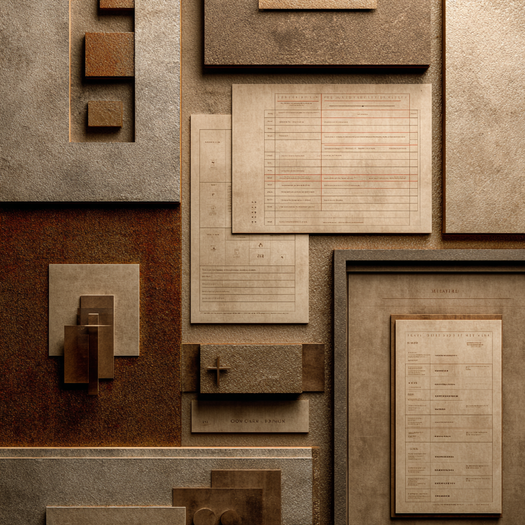
Tactile maximalism is the art of bringing out what matters without drowning the visitor in a visual flood. In a sector where every piece of information counts, the temptation to put everything forward is strong. This 2026 trend teaches you to use depth, relief and gradients to create a powerful visual hierarchy.
A wealth management adviser's site generally has three critical areas: the wealth review request, the booking, and the client testimonials. Those areas deserve visual treatment that sets them radically apart from the rest.
Buttons and calls to action with pronounced relief
Your main "request a free wealth review" button cannot look like the other elements on the page. Create a multi-layer relief effect: a subtle gradient of your accent colour (from light sage green at the top to dark sage at the bottom, for instance), a drop shadow across three levels of depth, and a slightly lighter border on top to simulate lighting.
On hover, that button can lift visually with an animation that reduces the shadow and raises the brightness, giving the impression that it is moving towards the user. That tactile interaction significantly raises the click-through rate: the human brain is wired to react to objects that look physically pressable.
Frames for the key figures
The key figures of your expertise deserve special treatment. Frame them in textured zones with discreet gold or copper borders. For instance, "23 years of experience" can sit in a square with a paper-textured background, a fine copper border and a light shadow giving the impression of a professional plaque.
Those frames should never be uniform: vary their size slightly according to the importance of the information. The number of clients supported can occupy a wider frame than the number of financial partners, creating an intuitive visual hierarchy.
Layout that plays on depth
Organise your sections in superimposed planes. The testimonials section can seem to float in front of a slightly blurred background. Your service cards can be arranged in light perspective, the front ones larger and sharper than those behind, inviting the scroll that reveals the full content.
That visual depth turns a flat web page into a three-dimensional space that catches attention and naturally guides the reading path.
7. Exaggerated visual hierarchy

Guiding the eye with no mental effort
In a world where attention online is counted in seconds, your site has to communicate its key messages instantly. Exaggerated visual hierarchy is not sensationalism, it is a strategic necessity. A visitor arriving on your site has to understand in under 3 seconds who you are, what you offer and why they should contact you.
That trend amplifies the contrasts of size, colour and position to create an obvious, irresistible visual path.
Oversized titles for the main services
Your flagship service has to have a title whose size visually crushes the other elements. If your specialism is advising on family business transfers, that title can occupy 80% of the screen width in a heavy typeface at 72pt minimum. The other services will have titles at 36 to 48pt, creating a 2:1 ratio that leaves no doubt about the heart of your expertise.
That exaggeration works because it removes the ambiguity. Your visitors do not have to guess what your main added value is; it hits them literally.
Key figures in monumental format
Turn your statistics into monumental elements. The number of millions of euros of wealth managed, your years of experience, your client satisfaction rate: those figures have to be shown at an outsized type size (120 to 180pt), in your accent colour, with a light gradient effect.
One Marseille firm shows "850M€" in 150pt characters on its home page, with the explanatory text "of wealth supported" at 24pt just below. That 6:1 size contrast creates a memorable visual impact. A/B tests show that presentation generates 63% more time spent on the page than a traditional one.
Priority sections that dominate visually
On your home page, the section about your free wealth review should occupy at least 60% of the vertical space of the first screen. A background in a contrasting colour from your palette, a massive call-to-action button, hook text in large format. The other sections, important as they are, should occupy only 20 to 30% of the space, immediately making clear the priority action you want your visitors to take.
That drastic spatial hierarchy transforms your conversion rate: rather than letting visitors lose themselves among equivalent information, you guide them firmly towards the most important action.
8. Naturalist design in its pure state
Evoking permanence through nature
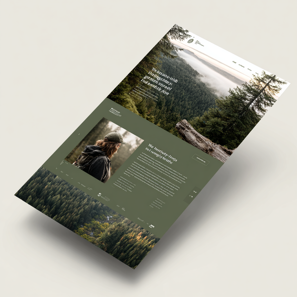
Wealth is built over the long term, passed from generation to generation, rooted in time. What better than natural metaphors to illustrate that dimension of time and permanence? In 2026, naturalist design for wealth management advisers goes beyond the clichés of forests and mountains: it is about subtly building nature's visual codes in to inspire trust and stability.
That approach resonates particularly with wealth clients who value transmission, durability and long-term values.
Subtle, symbolic natural imagery
Rather than generic stock photographs, select natural visuals loaded with wealth symbolism. A centuries-old oak behind your transmission section evokes solidity and longevity. Stacked pebbles in balance illustrate wealth diversification perfectly. Tree roots photographed in macro can accompany your message about rootedness and solid financial foundations.
Those images should never be garish or dominant. Use them as a semi-transparent background (15 to 25% opacity) or as a watermark, leaving the text in the foreground while creating a calming atmosphere.
A palette inspired by natural elements
Push your earthy palette towards shades drawn directly from nature: stone grey (#767676), sand beige (#D4C5B9), moss green (#8A9A5B), bark brown (#6B5D4F). Those colours are not theoretical, they come from precise natural references: the sand of a Brittany beach, the moss of a woodland floor, the bark of a pine.
One Bordeaux firm built its whole visual identity around the colours of the vineyards: clay soil, vine leaves, barrel wood. That coherence with the regional and natural identity reinforces the local anchoring and the closeness to local clients.
Organic texture effects
Section backgrounds can carry photographic textures of natural materials: wood grain for the family inheritance section, stone structure for wealth solidity, linen fibres for the crafted, personalised side of the advice. Those textures, applied at controlled opacity (20 to 30%), enrich the site visually without weighing the reading down.
The dividers between sections can take the form of organic, irregular lines rather than perfect geometric strokes, evoking the horizon of a landscape or geological strata, a metaphor for the different layers of a wealth strategy.
9. Modern neo-decor and refined geometric patterns
Elegance and prestige for a demanding clientele
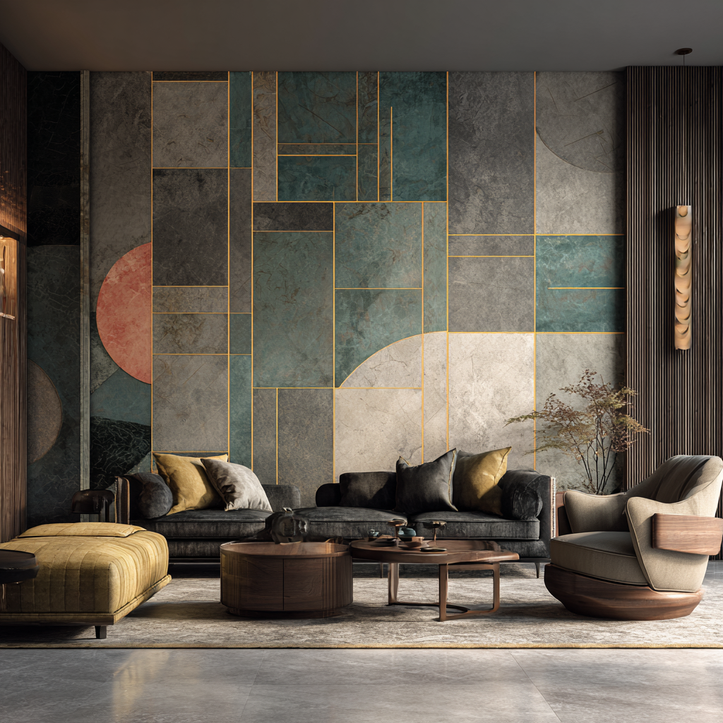
Wealth management advisers addressing wealthy or ultra-wealthy clients have to project an image of prestige and exclusivity. Modern neo-decor answers that need by building in sophisticated geometric patterns that evoke discreet luxury and refinement.
That trend has nothing to do with ostentation: it is a subtle elegance that reveals itself progressively, like an architectural detail noticed after several visits.
Geometric patterns in the background
Create subtle geometric patterns that dress your main sections without ever crushing the content. A very discreet hexagonal pattern (5 to 8% opacity), for instance, can dress the background of your services section, evoking the structure of a hive and the idea of methodically organised wealth.
Those patterns can be animated on scroll: a slight rotation, a change of opacity, a parallax effect that creates depth. One Paris firm uses a pattern of golden diamonds that reveal themselves progressively as the visitor moves down the page, creating an elegant effect of discovery.
Strategic metallic accents
Metallic touches have to be used sparingly to underline excellence and exclusivity. Icons with a subtle gold gradient (#B8860B to #FFD700) for your premium services, copper borders (#B87333) framing your high-wealth client testimonials, a discreet silver divider (#C0C0C0) between the major sections.
The metallic effect must never be shiny or garish. Favour matt or brushed finishes that suggest quality without tipping into flash. A very subtle gradient can create the illusion of metallic texture without weighing the interface down visually.
Decorative delimitation of the sections
Replace plain dividing lines with refined decorative borders. Minimalist geometric friezes inspired by Art Deco, angular ornaments framing your premium content areas, rounded corners with engraved patterns for your service cards.
One Geneva firm specialising in family office work developed a system of custom decorative frames for each level of service: a single border for standard advice, a double border with ornamented corners for premium advice, a triple border with a gold pattern for the family office service. That visual hierarchy instantly communicates where each offer sits.
10. Imperfect, authentic human illustration

Creating empathy through imperfection
Wealth advice is above all a human relationship. Yet too many advisers' sites use generic stock photographs or sanitised corporate pictograms that create emotional distance from visitors. In 2026, "imperfect" human illustrations break that coldness by showing that behind the expertise are real people.
Imperfection is not the same as amateurism: it is a visual authenticity that humanises your message and encourages emotional connection.
Hand-drawn characters
Commission or create line-drawn character illustrations, slightly imperfect, representing your typical clients at different stages of their wealth life. A young couple discovering property investment, a family preparing to pass on a business, a retiree improving their tax position.
Those characters should not be caricatures but stylised, endearing representations. The lines can be slightly shaky, the proportions deliberately approximate, giving the impression of a sketch made during a client meeting. That technical imperfection creates closeness: you do not draw perfectly, but you draw sincerely.
One Toulouse firm developed a whole series of those characters representing the archetypes of its clients: "Sophie, a senior manager preparing her buy-to-let investment", "Marc, a company head structuring his succession", "the Dupont family, improving their tax position". Those characters recur across pages, creating a coherent narrative thread.
Explanatory sketches of financial concepts
Complex wealth concepts gain from being explained through hand-drawn diagrams rather than smooth computer-generated charts. Splitting ownership, the structure of a family property company, how a capitalisation contract works: all of those subjects can be illustrated with line sketches that simplify without patronising.
Those illustrations can even carry handwritten annotations (a typeface imitating cursive) pointing at the important elements, as if your adviser had scribbled explanatory notes on the corner of a napkin over a business lunch.
Custom, humanised icons
Rather than using standardised icons from generic libraries, create a custom icon set in a drawn style. The icon for the wealth review can look like a hand-sketched notebook. The one for tax strategy can be a calculator sketched with deliberately irregular lines.
That visual coherence across every icon creates a strong, recognisable identity. A visitor who sees one of your icons out of context should be able to connect it to your firm immediately.
Illustrated testimonials
Accompany your client testimonials with illustrated portraits rather than photographs. That approach has two advantages: it protects the privacy of clients who prefer to stay discreet about their wealth questions, and it maintains visual coherence with the rest of your illustrations.
Those portraits can be produced in a uniform style (digital watercolour, charcoal sketch, vector illustration with texture) that fits harmoniously into your brand system while adding a touch of humanity.
3 concrete projects: when trends become results
Design theory takes on its full meaning once it meets the reality of the field. Here are three rebuild or build projects for wealth management advisers that applied these 2026 trends with measurable, significant results. Those concrete cases show you how to choose the right trends according to your position and your business goals.
Project 1: a conversion rebuild for an independent adviser in Lille
The context and the starting stakes
An independent wealth management adviser based in Lille for 8 years faced a classic but frustrating problem: his website generated very few qualified meeting requests. The design dated from 2019 and projected a cold, almost banking institutional image, in total contradiction with his actual approach on the ground: human, accessible and personal. His current clients valued his listening and his ability to explain, but his site reflected none of those qualities.
The project's goal was surgical: drastically raise the number of wealth review requests while naturally filtering out unqualified prospects. The adviser did not want to multiply his contacts tenfold only to spend his time turning the curious away; he wanted mature leads who immediately understood the value of his support.
The strategic design choices
Three trends were selected to answer those precise stakes: reassuring geometric simplicity to structure an offer that looked confused on the old site, Exaggerated visual hierarchy to guide people unambiguously towards the priority action, and the earthy colour palette to establish a climate of trust in the first seconds.
The rebuild concentrated every effort on the home page. The new design places a massive central block occupying more than 60% of the first screen with the message "personalised wealth review, free and with no commitment". The title uses a heavy typeface at 68pt on a sand beige background, creating a visual hierarchy impossible to miss. The deep sage green call-to-action button carries a pronounced multi-layer relief that makes you literally want to click.
The services are now presented as four square geometric cards perfectly aligned and spaced: wealth review, tax planning, retirement strategy, transfer of wealth. Each card carries a simple geometric icon, a short title and two lines of explanation at most. That visual clarity naturally guides the progression towards booking a meeting without swamping the visitor with information.
The results that speak for themselves
Three months after launch, the figures pass the initial goals. The firm records 41% more wealth review requests, but above all those requests are far better qualified than before. The average time spent on the home page has been multiplied by 1.8, a sign that visitors take the time to understand the offer before getting in touch.
The most satisfying result for the adviser? A significant fall in unqualified leads. Before the rebuild, around 40% of the contacts did not match his audience at all (students looking for free advice, people with no wealth to manage). Now, the clarity of the visual hierarchy and the message filters naturally: visitors immediately understand whether they are in the target or not, which saves the adviser precious time.
Project 2: a prestige build for a Paris transmission firm
The context and the specific stakes
A Paris firm specialising in family business transfers and support for company heads wanted a site worthy of its very high-end clients. Their problem was radically different from a generalist adviser's: they were not looking for a volume of contacts, but for ultra-qualified enquiries from company heads and wealthy families sensitive to prestige, discretion and absolute rigour.
The old site, professional as it was, completely missed their premium position. It looked like any accounting or legal practice's site, with nothing to set it apart. The challenge was to project an image of solidity, exclusivity and permanence without ever tipping into the vulgar ostentation that repels those sophisticated clients.
The trends chosen for a premium position
Three design axes structured the build: naturalist design in its pure state to evoke the long term and transmission between generations, modern neo-decor with refined geometric patterns to add a touch of elegance and prestige, and discreet metallic accents to underline exclusivity without excess.
The art direction draws directly on nature and lasting heritage. Images of centuries-old oaksappear as watermarks behind the key sections, subtly evoking solidity and longevity. Stone and wood textures dress the backgrounds at a controlled opacity around 20%, creating sophisticated depth. Art Deco geometric patterns at very low opacity (5 to 7%) ornament the banners, a subtle reference to the Parisian elegance of the 1920s.
The strategic "family business transfer" and "family office services" sections get particular visual treatment. They are framed by premium decorative borders inspired by Haussmann architecture, with touches of brushed copper that bring a sense of discreet luxury. The titles use monumental typefaces (90 to 120pt) that command respect without shouting.
Results that validate the repositioning
The traditional volume metrics mean nothing for this firm, and that is exactly the point. The site generates fewer contacts than before, but the quality has exploded. The conversion rate from meeting to signed engagement jumped by 62%, an exceptional result in high-end wealth advice.
The qualitative feedback from new clients is more revealing still. Several mentioned at the first meeting that the site had reassured them about the firm's standards, that they had "felt" it was addressed to them. The naturalist design and the heritage references created an emotional connection before any human exchange.
The most unexpected effect? The site became a tool of psychological alignment before the first meeting. The prospects who arrive for a consultation have already absorbed the premium position, understand the value of the support and are mentally prepared for the fees charged. The commercial discussions have become far smoother.
Project 3: an educational, gamified platform for a Nantes firm
The context and the regional problem
A regional firm based in Nantes wanted to stand out in a very competitive local market, with at least fifteen wealth management advisers active in the area. Their angle of attack: betting heavily on wealth education rather than on classic commercial messaging.
Their main audience, senior managers and self-employed professionals between 35 and 55, systematically said at exploratory meetings that they felt lost in the face of financial complexity. Life assurance, retirement savings plans, property companies, splitting ownership, capitalisation: all terms that intimidated them and held their wealth decisions back. The challenge was to make discovering those concepts engaging without undermining the firm's seriousness and expertise.
The design choices for educating without boring
Three trends were combined to create a unique educational experience: subtle gamification to turn learning into pleasant interaction, imperfect human illustration to humanise abstract concepts, and reassuring tactile textures to keep a professional image despite the playful approach.
The heart of the set-up is an interactive wealth profile quiz in 9 questions. Unlike the cold, technical calculators you usually find, this one uses accessible language and concrete situations: "if you received a 15,000€ bonus, what would your priority be?", "which wealth objective motivates you most right now?". Every answer advances an animated visual bar and triggers a micro-validation (a discreet green tick, a message of encouragement).
At the end of the quiz, the visitor gets a personalised result ("builder profile", "optimiser profile", "transmitter profile") with a dedicated page explaining its characteristics and the firm's services suited to that profile. The result can be downloaded as a PDF with a careful layout following the site's brand system.
The complex financial concepts are explained through hand-drawn sketches that take the mystique out of the subject. The family property company is illustrated by a house-and-family diagram in shaky lines with handwritten annotations. Splitting ownership is drawn as a tree whose roots (the bare ownership) and fruit (the usufruct) are clearly separated visually. That imperfect visual approach makes the concepts memorable and less intimidating.
A discreet system of progress badges rewards visitors' engagement with the educational content. After reading three articles on tax planning, an "tax explorer" badge appears. After using the savings capacity calculator, the "strategic planner" badge unlocks. Those badges keep a clean, professional design (simple geometric icons, the site's earthy palette) to avoid any childish effect.
The results of an educational approach
The figures fully validate that strategy of differentiation through education. The firm sees 47% more completions of the long forms, a remarkable result given that their wealth review form asks for around fifteen detailed pieces of information. The visual progress system in 5 steps turned an administrative chore into a reassuring guided path.
The significant rise in returning visitors (measured through Google Analytics over 90 days) shows that the educational content creates lasting engagement. Visitors no longer come once to fill in a form; they come back to read the articles, retake the quiz with different parameters, use the calculators provided.
The most strategic gain concerns the maturity of the leads. The prospects who book after engaging with the educational content arrive with a significantly higher level of understanding of wealth matters. They already know the main concepts, have identified their priorities through the quiz and ask far more precise questions at the first meeting. That maturity speeds up the sales process and raises the conversion rate.
Conclusion: turning your digital presence into a competitive advantage
These 10 design trends are not passing fashions: they answer a deep transformation in what your wealth clients expect. In 2026, your prospects are no longer only looking for an expert in numbers, they are looking for an adviser who understands them, reassures them and supports them with transparency and humanity.
Your website has become your best salesperson, around the clock. It works for you while you sleep, it answers your prospects' first questions, it filters the qualified contacts and it lays the foundations of trust before the first meeting. Every design element you choose sends a message: the transparency of your data inspires trust, geometric simplicity translates your clarity of mind, tactile textures humanise your approach, natural colours calm wealth anxieties.
Implementing these trends does not necessarily require a complete rebuild of your site. You can start with one or two elements that resonate particularly with your position: an interactive quiz to qualify your prospects, an earthy palette to soften your image, authentic illustrations to create closeness.
What matters is staying coherent with your firm's identity and your professional values. An adviser specialising in family transmission will gain from betting on naturalist design and human illustration. An expert in tax planning for entrepreneurs can favour geometric simplicity and exaggerated visual hierarchy. A family officer addressing wealthy clients will find their strength in refined neo-decor and discreet metallic accents.
Digital wealth management in 2026 no longer comes down to displaying your qualifications and your years of experience on a static page. It is about creating an experience that educates, reassures, engages and converts. Your site has to be as worked as your advisory strategy, as considered as your investment recommendations, as personal as your wealth reviews.
The question is no longer whether you should modernise your online presence, but when you will do it. Because while you think about it, your competitors are already implementing these trends and capturing the prospects who could have been your clients.
Ready to turn your site into a wealth conversion tool? These 10 design trends give you the roadmap. It is up to you to choose where to start, and make your digital presence a genuine competitive advantage in winning new wealth clients.
.jpg)

.webp)